Julie has kindly lent me a 'gorilla grip' tripod which will hopefully help me 'lose' the tripod legs in shot that have been a problem so far.

Here's one in action that I found in Google images.
It took a while to find a suitable thing for it to grip to so that I could get everything I needed in shot but I settled on my trolley which, on set up, seemed ok.
You have to make sure the grip is really tight or the camera will move slightly when taking the shot (and I don't have a remote shutter, so I need to be gentle when pressing the shutter.


I wanted to experiment with the colour again today. I've decided not to complicate things too much as the more I bring in on layers, the more chance I have to move things about, rabbits etc, when I don't want to.
I started off with the lightest photo background (the one copied over tracing paper, set on light setting)

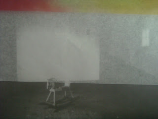
The image is still dark and moody enough to suggest gloom and isolation - not exactly a nice place to be and one a child would rather be out of.
I then gradually dropped in a piece of white tissue/tracing paper (they called it tracing paper in the art shop - looks more like tissue to me!) from the top of the frame

Already you can see the contrast.
Once the tissue had dropped in about 2/3 of the way I started to drop in the strongest coloured acetate on top of it.

Obviously for the actual animation itself, the rabbits will also be in shot so again, it is really important to keep everything in place as much as possible. This is actually really hard to do. When you drop something in from anywhere, layers move other layers. You have to be aware of where everything is. It's best to mark out on the floor where your base image is and any other subsequent layers when they're in place so that everything is sinc'd up.

By the stage above, you can just see the background photo but the colour stands out better and once the rabbits are added, they too stand out well.

The rabbit character stands out sharply from the background and the whole thing looks more cheerful here.

They become central to the piece rather than the background, which is what is needed at this stage. It's they that are important.
Next I had to re-look at my text boxes. First of all I outlined them in strong felt marker so that they stood out against the images.

The text is the most important thing at this point in the animation as it is the informative bit. Our attention has already been drawn by the question - Lonely? and the statements Try Creative Learning! Make New Friends! Now we need to know how to do this - where to go etc.
The small Join Us box will sit behind the rabbits nicely but by the time you get to the next text boxes they are too big to do this - the letters become blocked by the rabbits so you would either put the boxes over the rabbits or take the rabbits out altogether

I like this image because the rabbit is looking up at the information. This is good as the rabbit is still interacting with the piece - in the same way as the viewer is.
It wasn't easy to get the text boxes in shot - using the zoom on my camera and experimentation is the only way. The text needs to be seen large enough to read. Also important - keep this information on screen for a few seconds. Take lots of stills of each text box.
When the bigger box comes in and the last one, the rabbits are removed from shot so the text stands out clearly. I've reduced the size of the website line in this shot as it was too big to fit on the screen properly. I've also bordered it in blue to compliment the colour of the web address (which everyone recognises as blue).

This shot seemed to be successful until I noticed that you can see the side of the trolley in shot at the bottom. I had to raise the camera up a bit to get rid of this - again, it's pretty tricky as a lot of things can move - the grip, the trolley handle, the trolley.....

It wasn't possible to get the side of the trolley totally out of shot without losing a lot of what I needed in frame. So I have to decide what works best - the tripod or the gorilla grip.
The last shot I want is that of the organisations involved - their logos. I resized the images in Word. These are fine when they're in a shot on their own but too big to include on the text box before. I have made them smaller and will try to fit them on the last text box but think they'll probably crowd it out.

So I've added the website address in again (smaller, to fit on the page)

The boxes are a little wonky so need tweeking. On the floor they look horizontal - always check from behind the camera - the angle changes as the camera is gripped at a slightly wonky angle! Perhaps it adds to that 'hand made' feel? : )
This is what the re-sized (smaller) logos look like when added to the final text box:

They crowd it out a bit - and, because they're so small, don't have the weight to sit flat onto the paper, so all in all, I think I may go for the larger images on their own.
No comments:
Post a Comment