Saturday 22 May 2010

Summary of Intent & Development, Evaluation

22/5/2010

Summary of Intent & Development

I began this assignment with intrepidation as animation is a totally new process for me. Having looked at examples (of which there are so many) via www.youtube.com the idea of putting a message across in this way was very exciting but daunting.

I aimed to take the end my last assignment as the starting point for this one. Suffolk Family Learning, in partnership LSC, LEAP with Suffolk County Council run arts and education sessions for children locally which encourage creative play with parental involvement (sb p59, pf sec.4). This is an important provision in the area as it brings families together and allows children to mix in different peer groups. Their parents/guardians have the opportunity and space to play/work with their children and meet other adults in similar situations. They are also made aware of any other courses they may, as adults, be interested in at the centre. ‘Creativity’ by Sandy Green embeds the importance of creative learning with useful and inspirational activity ideas.

Peter Hewitt, Chief Executive, Arts Council stated in his Framework for Arts, Health and Wellbeing that

The positive impact on children and young people’s health and wellbeing must be added to the widely recognised impacts on learning and development experienced through participation in arts activities. The country’s long-term aspirations as a creative economy depend on providing opportunities now for children and young people to participate in arts and creativity.

In early children’s education development, art is an instinctive force to be used and developed. It acts as a vital form of communication, especially in settings where verbal or written communication is inhibited or limited. The creative learning practitioner can use arts based activities to strengthen family communication, addressing possible issues such as behavioural, mental and physical health problems, as well as those concerning self-esteem etc. Developing enthusiasm for creative learning will help strengthen confidence through contributing to enjoyable, ‘hands on’ arts activities. Children and their families should be given the opportunity to express ideas and feelings through creative means as well as more formal ones. Creative learning sessions adhere to the principles of the Government’s Every Child Matters policy (see Appendix 1).

Although children/parent/guardian-based sessions such story telling, reading, games and music are also available through Suffolk Family Learning and LEAP (sb p59), I am concentrating on the arts and crafts based ones which I feel provide a bedrock for wellbeing, creative and social development in children, because creativity emerges as a child becomes absorbed in actions and explorations of their own ideas, expressing them through making and transforming things. It involves children initiating their own learning and making choices and decisions, responding to what they see, hear and experience.

‘Through the arts, children will also develop original ideas, explore issues and solve problems. Children will take part in different activities – from singing and composing their own music to photography and animation’ http://www.dcsf.gov.uk/primary-curriculumreview/downloads/83306-COI-DSCF-CurriculumReview(Summary).pdf

To start the project off I needed to start a mind-map so that I could visualize my options:


The use of animation to draw these sessions to the attention of parents and children is both creative and instant, immediately appealing to children and adults alike. I first looked at different examples including Claymation, drawn animation with After Effects and Flash (beautiful effects here but unfortunately we don’t have access to the programme at college), sand animation stop-motion, etc. (b 2.01.10 animation for the nation). The possibilities are endless and this, for me, is almost off-putting – I needed to start from the very basics as I was absolutely ignorant of the processes involved.

I then investigated children’s educational animation examples such as When I Grow Up - Justin Seau in Final Cut Pro, After Effects http://www.youtube.com/watch?v=gQ34KTHUQlc This is an animation that explores the family and ambition of five children. The children were interviewed then asked to draw their family and themselves. The drawings were traced, then animated in After Effects. This really appealed to me as it directly connected the children in the animation to the children's voices and any watching the animation - brings their world to real life.

Eat This Child Originally Mangez Cet Enfant. http://www.youtube.com/watch?v=ISOr600QCm0 Grey Gerlings series of weekly animated cartoons, made from index cards and ink and Advent Of Sock http://www.youtube.com/watch?v=cLN511gm-G8 really appealed to me visually .
They work particularly well with the music. Colourful, engaging, modern yet reminiscent of 50s cartoon/superhero characters, they hold the attention from the beginning and have a slightly comical, yet serious feel to them.

Having researched storyboarding (sb p3,4; pf Sec. 3) at http://andypages.com/images/kiddwest/storyboard01.jpg and http://animation.about.com/od/recommendedreading/qt/storyboarding.htm and How to storyboard your film – Indy Mogul http://www.youtube.com/watch?v=e-yel83f6s for ideas and essential points I aimed to use one to make a small animatic.

It’s important to express what you want to say in both written and storyboard form. From this ideas are further developed. I looked at more tutorials (e.g. Photoshop tutorial basic animation: http://www.youtube.com/watch?v=Taq5PHQbjDk and How to Create a Stop Motion Animation - http://wikihow/com/Create-a-Stop-Motion-Animation)
– the more familiar I felt with a technique (even if I haven’t actually done it) the better I’d feel about having a go at it.

I wanted my animation to:
• Be emotive
• Have a cause – (creative play and education)
• Be inspirational
• Be visually stimulating and engaging for both children (4 – 12 year olds) and their parents/guardians.

Basic/initial premise for the storyboard (sb p36)

• Lonely child, in a grey/black/white room, bored and isolated – the room would be a black/white photograph (sb p 24 & 32)
• Hand written text appears – Bored? Lonely? In black ink
• More text appears – ‘Want to have FUN (in colour) and MAKE NEW FRIENDS? (colour) – again hand written, bit like a child
• Gradually text appears to advertise LEAP/SCC/LSC and the lonely child/figure starts to stand up, smile and move into a world of colour
• Introduce colour
• Introduce other children and parents (sb p34)
• Colour the original child
• Bring in ‘arts and crafts’ materials – real ones, such as wax crayons, crayons, string, etc
• Finishes with the child making new friends, with children’s’ art shown as backdrop in a riot of colour.
• List of sessions available – just in coloured text form – hand written
• LEAP, SCC and LCS logos (sb p 63), website and telephone numbers.

The overall story is of a negative situation becoming a positive, happy experience for all through these creative learning sessions – encouraging positivity, wellbeing and eventually raising aspirations.

I have looked at a lot of hand drawn animation (b 2.1.10 animation for the nation,) Katy Davis’ Animation 2.mov http://www.youtube.com/watch?v=4lyAArIPHUw and Gone Fishing http://www.youtube.com/watch?v=X3aV1yHQtfU were particularly inspiring but I felt this would take too long a time to produce. It’s a 30 second long animation and that’s a lot of drawings!

With Corinne, I made an animatic from a combined storyboard (based on the film Titanic – see 30 Second Bunnies on YouTube www.angryalien.com" b 27/2/2010) and put it into Premiere Pro 1.5 (an animation programme available at college). This gave me a feel for timings – how long each shot should be on screen for etc. Unless you do it, you have no idea how timing affects what’s being put across (b 1/3/10 & 8/3/10).

I have explored different types of animation techniques (blog 13/3/10), so experimented briefly with smudge & click (sb p 17-21), cut-out figures (sb p29-30), cel animation, (sb p53, 54) stop-motion and plastic toys (with moveable limbs (sb p37-40). I tried some of my own, as well as looking at children’s illustrated books for inspiration. I used a rabbit character for example to appeal to young children (sb p46). I aimed to make use of Derek’s’ expertise in the TV studio, when possible – time is very limited in there. When using actual toys/figures, settings, camera angles had to be considered but it was fun trying (b 18/3/10, 29/3/10).

This type of advertising may also inspire older children to have a go at the animation process themselves. My animation knowledge is pretty basic and therefore not too ‘slick’. It will have a ‘hands on’ feel to it. Zu3D is a new stop-motion animation programme specifically used in schools, which is really inspiring (pf Sec. 3).

I also looked at possible soundtrack ideas – wanting it to start off stark and rather sad to start off with (b 29/3/10;10 & 11/4/10) e.g.: Melancholy: Sad Piano/Violin Music http://www.youtube.com/watch?v=UcXXpssBFVM (too much?) and Very Sad Piano Music http://www.youtube.com/watch?v=XiPP7fA53fM and then ‘dissolve’ into something more upbeat e.g.: The Man Who Chose to Smile http://www.youtube.com/watch?v=UZ7C1q1OyJQ – not quite right but add in children’s laughter from BBC Sound Effects CD. I realize I probably won’t have time to add the soundtrack but it’s important to visualize it against the storyboard (pf Sec. 3).

Text was also an important issue and how to present it. I wanted hand drawn ‘bubbles’ for the words aimed at the child and text boxes for the activity information. I also sourced the relevant logos. I had a choice of dropping it into each shot by hand or adding it in Premiere Pro 1.5 at college. I needed to work out which felt right in the context of the overall animation.

To keep a record of my research, experiments and progress I have started my own Blog LuceAnimation: www.luceanimation.blogspot.com This is a great way to put down thoughts and experiences as they happen as well as providing the means to upload video examples and my own attempts. I have also created a YouTube account which makes uploading movies easier onto my blog.


EVALUATION

Animation is a visual means of communicating an idea which is part of an important communication process, especially where verbal communication is difficult. My aim was to promote the creative learning activities on offer to local families. I investigated animation films for educational use: http://www.swgfl.org.uk/Learning/Film-Animation-Mini-Site/Case-Studies/Animation & www.netover.com/~kingskid/dolch_store/indexstore.html Each combined visual and message effectively.

To fully engage with the project I had to fuse thinking analytically with practical application.

After experimenting with various techniques, I settled on cut-out figures, starting with a boy (sb p31,32,33), and finally rabbits, (more child friendly, b 20/3/10) embarking on a series of experimental photo sessions at home. I sourced a black & white photograph of a dark, empty room as background to suggest isolation upon which my rabbit would respond to messages delivered through speech bubbles.

The process was time-consuming and painstaking, needing endless patience. In an ideal studio setting, producing a professional product would take months and cost much more than the ‘hand-made’ approach I had to take. However, this suited the animation’s purpose better. I borrowed tripods to steady the camera and experimented with colour addition to change the mood, using Photoshopped acetates, (b 19/4/10, pf Sec 4) & ‘sliding’ them over the background photo. This wasn’t easy. Everything moved around and the colour didn’t stand out effectively against the photo. Introducing tracing paper to ‘diffuse’ the photo improved things (b 23/4/2010 & 29/4/2010). Adding cutouts and actual objects (coloured pencils) increased the risk of unwanted movement and continuity problems – easily knocked out of position, sliding on the acetate etc. I minimized this using tape to mask off and secure layers (b 6/5/2010), and blu-tac to stop crayons rolling between shots. The crayons had to be cut in half to work proportionally with the rabbits. To help the animation
reflect ‘positivity’ through creative learning, the rabbits needed to interact with the crayons, so used them to colour each other (b 6/5/2010 & 10/5/2010).

Informal and formal text was important. Sizing and positioning was an issue (b 24/4/10) which was overcome by re-scaling and bordering, whilst retaining the hand-made feel.

Working in college’s Premiere Pro 1.5 was sometimes problematical and therefore frustrating. It didn’t work consistently enough to give all the desired ‘effects’ – ‘dip to black’ worked, ‘dissolve’ didn’t (b 10/5/2010), but trial and error is part of the learning process.

Difficulties encountered meant lessons learned – taking so many photos required high memory card capacity and battery power – running out half way through a sequence (natural light changed over time, affecting the subsequent photos) meant continuity was lost, as well as the zoom settings. Tripods moved about and gave an unwanted ‘flicker’ effect to sequences and fingers appeared in shots which then had to be deleted. My own shadow on the acetates only showed themselves in the animation themselves – adding to the charm of the piece?
Given more time and knowledge I would experiment more with different techniques and not be afraid to push them further. I would try different camera angles and studio lighting techniques to give a more realistic and professional feel. ‘Zoom’ often creates authenticity, but in my case wasn’t appropriate. I would add in a soundtrack to compliment the animation itself and give it weight. Although animation confounded me, further practice will improve my techniques in future.

Bibliography & References

sb = sketchbook (Assignment 2 Animation)
pf = portfolio (Assignment 2 Animation)
b = blog

Graber. S. Animation – A Handy Guide (2009) A & C Black Publishers Ltd, London

Green. S. Creativity (2004) David Fulton Publishers, London

Media Knowall ‘Camera angles’ [Online]. Available at www.mediaknowall.com/camangles.html (Accessed 22 February 2010)
Education and Learning (2009) ‘Parenting and skills for families’ [Online]. Available at www.suffolk.gov.uk/EducationAndLearning/CommunityLearningAndSkillsDevelopment (Accessed 29 February 2010)

Zu3D ‘Stop-motion animation programme for schools’ [Online]. Available at www.zu3d.com (Accessed 8 March 2010)

The Official Magazine. Windows How to Animate A Cartoon using Windows Movie Maker [Online). Available at http://www.officialwindowsmagazine.com/guides/how-to-animate-your-own-cartoons-using-windows-moviemaker/ (Accessed: 13 March 2010)
Arts Council England Framework for Arts Health & Wellbeing [Online]. Available at: http://www.artscouncil.org.uk/media/uploads/phpC1AcLv.pdf (Accessed 30 April 2010)
Department for Children, Schools and Families Every Child Matters, Early Years [Online] Available at www.dcfs.gov.uk/everychildmatters/earlyyears/surestart/whatsurestartdoes (Accessed: 19 April 2010)

Links

www.suffolklibraries.co.uk
www.suffolkchildrenscentres.com
www.leap.ac.uk
www.youtube.com
www.luceanimation.blogspot.com


Appendix 1 – EVERY CHILD MATTERS and my response to it.

To be healthy. It may be that through social deprivation and lack of education children and their parents/carers have not had access to healthy lifestyle options. As the Centre offers Child and family health services arts activities and learning should be to promote healthy lifestyle aims. Participation in these activities helps develop a positive mental attitude/improved mental wellbeing for families who may be in crisis for a number of reasons – health and social issues for example. Having an opportunity to make new friends and back this theory up also.

To stay safe – LEAP/SCC/LSC centres provide a safe environment which complies to all high level health and safety standards. All equipment and materials are safe to use and are used safely and good behaviour and respect towards others is encouraged.

To enjoy and achieve – art is one of the most enjoyable ways to learn. It’s expressive and tactile nature means that it is open to participation by all. With help and encouragement, children and parents/carers of all abilities can learn new skills together, produce individual or collaborative work, which then can be part of a portfolio or displayed. A sense of achievement is created and aspirations are raised as a result. Allowing soft outcomes as well as hard ones means everyone is included and able to reach their full potential.

To make a positive contribution, to society and those around them. Offering a range of creative learning activities to a mixed setting of children and their families from different socio-economic backgrounds can also have considerable benefits for children everyone taking part. Equality and diversity is key to this provision to ensure that everyone is treated fairly, with dignity and respect. Preparing children to live in a diverse, multiethnic society through arts based education builds a strong foundation for future harmony and integration. Try to include as many cultural references as possible and not actively accentuate one in particular. Reflect a diverse community – essential in early learning education which makes for a more tolerant society as a whole. This in turn will lessen the desire/possibility to turn to crime later through boredom, ignorance and lack of tolerance. Creative family learning and having pride in one’s part in it can only strengthen family values by setting a positive example (both by staff and service users) and therefore impact positively on the community as a whole.

To achieve economic wellbeing Children and their families to learn and share experiences and then pass this onto others which is essential to their taking ownership of their lives. Creative learning creates a sense of achievement, can release potential not otherwise shown and encourage children and adults alike to think ahead, learn more, take up new opportunities and eventually enter or re-enter employment or training. Community values are strengthened (for children at an early age) and this in turns lessens the likelihood of crime in their future as a sense of ownership and pride has been created early on.
Monday 17 May 2010

Vis Comms session 17 May 2010

Special effects 17/5/10

Saved last week's final cut as The Big One Final 3. Want to continue looking at timings, plus add effects to try to 'polish it off' a bit - give it a bit more of a professional finish.

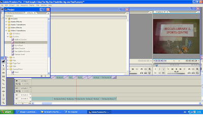
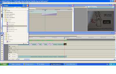
Looked at Video Transitions and the Cross Dissolve tool. Where the frame sequences didn't have a natural break I used the razor blade tool to insert one. I wanted the frames between the text boxes to dissolve into/fade into each other. This proved more difficult than I thought.

Effects
Video Transitions
Dissolve
Cross Dissolve


For some reason the dissolve effects were not that prominent. On Julie's advice, I rendered after using the dissolve tool. I also tried to elongate the dissolve areas, not to much avail but it did work in some areas for some reason. We neither knew why the process was so inconsistent but it may be something to do with Premiere Pro in the college, which is a little frustrating, but part of the learning experience!

I also used the Dip To Black tool at the end of the animation - gives it a more professional ending, rather than the abrubt one it had previously.


The final sequence as it stands is 49 secs 23 frames as below:


To be honest, I'm not that happy with this result. I'm not sure if it's because it's showing small, but it looks blurry to me. I'll try to save it to DVD and play it from there. If it's bigger it may look better...

To save to DVD:

In Premiere Pro 1.5
FILE
EXPORT to DVD
DVD Burner
RECORD

Need to go through my blogs and find the Youtube URL addresses for the animations I particularly want to reference in my summary/evaluation.

Monday 10 May 2010

Vis Comms session 10 May 2010 Messing with final photos..the edit

10/5/2010

Saved my 'tracing paper/colour acetate' sequence in Premiere Pro and uploaded movie file to YouTube and back into the relevant blog. Saw my fingers appear in a couple of frames so used the 'mountain' tool in Premiere to enlarge and reveal the relevant frame number (DSCN02751). Then used the 'ribble delete' + Clear to remove the frame. Then used Sequence, Render Work Area to 'smooth out' the running sequence. Still looks very 'rough' round the edges but serves the purpose of the process.


So - onto the Big One. In Premiere Pro 1.5 I imported all 571 photos and ran the sequence as is. For some reason the last photo also appeared in the first frame so I took that out using the same method as before.


Tutorial with Julie:

Had a look at the first run through - there's a lot of flicker created
because of my shadow on the acetate layers as I was taking photos. You
can also really see the changes in light. We agreed that this looks 'ok'
in the context of this animation as it's fairly 'hands on' and 'rough around
the edges', also taking into account that it was done at home. It may be
that Derek may be able to help in Final Edit - if there is time and space to
use the studio that is.

Possibly look at what the costs would be if you used a professional studio.

The run through as it stands now is over 60 seconds. I need to look at what
I think needs to be on screen for less and what might need to have longer
exposure (text boxes etc). To do this I need save the Premiere file to a
Movie file and have a look at where this needs to take place. You get a more
realistic view of it when in movie form.

Select the frames you want to increase in speed by running through the
sequence frame by frame using the arrow/cursor. Use the RAZOR tool and cut
on the Playhead.
Go to CLIP, SPEED DURATION and increase to (for example) 200%. If you want
to make the sequence last longer (eg Text boxes) you need to decrease the
frame duration. Use the same method but REDUCE the percentage accordingly.


This is it after the first 'cuts' - you can't see a lot of difference right now, but once the rest of the editing is in place, it should fit better into a 30 second sequence.


Tried a few more 'cutting' edits... was getting quite a few overlaid frames for some reason. The last one (below) is just under 50 seconds. Worth looking at the movie version to get an overall feel - write down what I observe and make final changes in next week's session.

Thursday 6 May 2010

The Big One....

6/5/2010

Wanted to do a complete run through today, taking into account everything that I've learned so far - the good and the bad. I needed a full day to set up and run the sequence. I'd tried to start the other day and got interrupted which meant the light changed etc.

I tried again with the gorilla grip - to a chair, but you could still see the chair legs, in spite of the zoom. The trouble with having to zoom in in order to get rid of legs/handles or whatever the grip is attached to, is that you lose a lot of the A4screen size and therefore your shooting area. I then attached it to the side of my trolley, as opposed to the handles, which worked better.


I masked out the area (A4) that I wanted to shoot, in black gaffer tape directly onto my bedroom floor. This would make sure everything was in place and give me something to tape down photo, tissue paper and acetate layers.


Here you can see the black/white photo image, tissue paper and coloured acetate taped down. However, there were problems intially as I was trying to 'drop in' the tissue followed by the coloured acetate. Because I'd sellotaped the corners of the black & white photo onto the gaffer tape edges, I couldn't drop the final piece of the tissue and acetate and had to peel off the sellotape in order for them to slide under fully to the bottom. This meant running the risk of moving things about and ruining continuity, as sellotape is really hard to peel off gaffer tape!

I zoomed in to get the image full into my camera shot - this meant losing a little of the A4 size. I then marked off the actual area that showed in shot, onto the acetate with black marker pen. This way I knew where to place the rabbits and text to make sure they were in shot (as the area was smaller than A4)

This sequence had its fair share of problems, all of which drove me to distraction. At first all was going pretty well. I was being really careful moving things about and trying not to bang into the trolley or tripod grip when moving the cut-outs. I'd got the zoom where I wanted it and as long as you don't turn the camera off by mistake, it will stay on that zoom setting (even when it's goes into 'sleep' mode). Then the flipping camera battery went dead!! Not good... time for a break while I took it off the gorilla grip..

Problems occuring due to that...

It takes a good 40 mins for the battery to fully rechage (which I needed it
to do in order for it not to 'die' on my again. The light in the room had
therefore changed by the time I got back to it.

It's very difficult to reattach th camera onto the grip in exactly the same
place.

It's difficult to get the exact zoom setting again.

Still, these things are sent to try us, and I did my best to get everything back into the right place, even though it took a long time.


I took more 'same' shots this time so that some shots remained on screen for more than a split second, when the speech bubbles came in, for instance.

By the time the crayons started to appear I had to be really really careful. It's so easy to knock one out of place, or one will knock a rabbit out of place. So much has to be be moved. In order to combat this a little, I moved one or two things only in one shot.


It was very time consuming and laborious but needs to be done this way.

The two rabbits came in from each side, crayons ending up in their paws, which started to colour in the middle rabbit. This was a lot harder than it looked. There's not a very big area in which to work in for a start. Trying to draw with pastel is easier than in crayon, but the rabbits still move around, even when being held down. It's really hard to 'colour them in' on the flat like that. However, as this animation is supposed to have that 'hand made' feel to it, this shouldn't matter too much.


Other crayons came in and began to colour in the other two rabbits.


I made the crayons and two side rabbits disappear until eventually there was only the middle rabbit left. I wanted the frame to be fairly clear ready for the text boxes to appear.


At this stage there was room for a small text box and the middle rabbit. In order for their to be room for the next box, which was bigger, I moved the rabbit down the page.


until eventually that rabbit disappeared


leaving room for the Information text box. I took lots of same shot stills for each text box so they remain on screen for a few seconds, in order for the information to be taken in by the viewer.


Finally the orignal happy rabbit reappears with the website address and the logs appear also - lots of shots taken of each - same shots, with the rabbit moving only slightly to 'point at' each logo.


All in all I have taken 573 photos!!!! It has taken ages to transfer them onto my laptop and then memory stick. Have to have a lot of memory on all software for this kind of project. Hopefully there is enough here for a 30 - 60 second animation. I will put this into Premier Pro on Monday,......and then work out some effects, render etc., and upload it to my Blog...

Friday 30 April 2010

not getting to grips with.......small needs to be smaller!

30/4/2010

I'm going to have to think of something more solid to fix the gorilla grip to = the handles/bar of my trolley moves around too easily and I keep getting the trolley in shot. Also, the gripper is not staying put, no matter how hard I try so I'm liable to move the camera from shot to shot which ruins the continuity. It's a shame but I'll persevere and find alternatives.


you can clearly see the side of the trolley in the above frame. Everything is so time consuming but I must remember to check the frame before shooting - EACH time.

I bought smaller wax and coloured crayons yesterday as the others were too large to compliment the rabbits and move about easily. However, once the rabbits were in place, even these crayons were too big. I've decided to use only 3 rabbits so that the two outside ones are the ones which take the crayons and point them at the middle one.


It's not easy to move the crayons about without moving the rabbits out of sequence. In fact, I was getting really wound up by it (surprise surprise!). It's very painstaking, this type of animation. Because you have to move all the pieces, it's toally tactile and totally prone to loss of complete control over them. The acetates mean that the background images move about a lot, in spite of being blu tac'd down where possible. Again, I must remember to 'register' everything and be as gentle as possible when moving the pieces. It requires the utmost patience and care, this hands on approach.

Also - the crayons being too big mean it's not very effective trying to position them round to ended up in the rabbits' paws....


In this shot they look clumsy. These were the smallest crayons I could buy but I then thought of an idea. Cut them in half and turn them into mini crayons that would suit the size of the rabbits more and give a bit more space for manouvre.


This works a lot better. I will still have to use a tiny amount of blu tac to keep them in place, but at least I'll have more space around them when moving them.

I want the two outside rabbits to colour in the middle one towards the end. To do thsi easily I will use coloured pastels to do the actual colouring. They're easier to make marks with than wax or crayon which would move the rabbit around too much I'm sure.


I would keep the rabbits still and just keep adding more colour slowly, shot by shot.


Thursday 29 April 2010

gorilla grip vs colour & tissue paper...

29/4/2010

Julie has kindly lent me a 'gorilla grip' tripod which will hopefully help me 'lose' the tripod legs in shot that have been a problem so far.


Here's one in action that I found in Google images.

It took a while to find a suitable thing for it to grip to so that I could get everything I needed in shot but I settled on my trolley which, on set up, seemed ok.
You have to make sure the grip is really tight or the camera will move slightly when taking the shot (and I don't have a remote shutter, so I need to be gentle when pressing the shutter.


I wanted to experiment with the colour again today. I've decided not to complicate things too much as the more I bring in on layers, the more chance I have to move things about, rabbits etc, when I don't want to.

I started off with the lightest photo background (the one copied over tracing paper, set on light setting)


The image is still dark and moody enough to suggest gloom and isolation - not exactly a nice place to be and one a child would rather be out of.

I then gradually dropped in a piece of white tissue/tracing paper (they called it tracing paper in the art shop - looks more like tissue to me!) from the top of the frame


Already you can see the contrast.

Once the tissue had dropped in about 2/3 of the way I started to drop in the strongest coloured acetate on top of it.


Obviously for the actual animation itself, the rabbits will also be in shot so again, it is really important to keep everything in place as much as possible. This is actually really hard to do. When you drop something in from anywhere, layers move other layers. You have to be aware of where everything is. It's best to mark out on the floor where your base image is and any other subsequent layers when they're in place so that everything is sinc'd up.


By the stage above, you can just see the background photo but the colour stands out better and once the rabbits are added, they too stand out well.


The rabbit character stands out sharply from the background and the whole thing looks more cheerful here.


They become central to the piece rather than the background, which is what is needed at this stage. It's they that are important.

Next I had to re-look at my text boxes. First of all I outlined them in strong felt marker so that they stood out against the images.


The text is the most important thing at this point in the animation as it is the informative bit. Our attention has already been drawn by the question - Lonely? and the statements Try Creative Learning! Make New Friends! Now we need to know how to do this - where to go etc.

The small Join Us box will sit behind the rabbits nicely but by the time you get to the next text boxes they are too big to do this - the letters become blocked by the rabbits so you would either put the boxes over the rabbits or take the rabbits out altogether


I like this image because the rabbit is looking up at the information. This is good as the rabbit is still interacting with the piece - in the same way as the viewer is.

It wasn't easy to get the text boxes in shot - using the zoom on my camera and experimentation is the only way. The text needs to be seen large enough to read. Also important - keep this information on screen for a few seconds. Take lots of stills of each text box.

When the bigger box comes in and the last one, the rabbits are removed from shot so the text stands out clearly. I've reduced the size of the website line in this shot as it was too big to fit on the screen properly. I've also bordered it in blue to compliment the colour of the web address (which everyone recognises as blue).


This shot seemed to be successful until I noticed that you can see the side of the trolley in shot at the bottom. I had to raise the camera up a bit to get rid of this - again, it's pretty tricky as a lot of things can move - the grip, the trolley handle, the trolley.....


It wasn't possible to get the side of the trolley totally out of shot without losing a lot of what I needed in frame. So I have to decide what works best - the tripod or the gorilla grip.

The last shot I want is that of the organisations involved - their logos. I resized the images in Word. These are fine when they're in a shot on their own but too big to include on the text box before. I have made them smaller and will try to fit them on the last text box but think they'll probably crowd it out.


So I've added the website address in again (smaller, to fit on the page)


The boxes are a little wonky so need tweeking. On the floor they look horizontal - always check from behind the camera - the angle changes as the camera is gripped at a slightly wonky angle! Perhaps it adds to that 'hand made' feel? : )

This is what the re-sized (smaller) logos look like when added to the final text box:


They crowd it out a bit - and, because they're so small, don't have the weight to sit flat onto the paper, so all in all, I think I may go for the larger images on their own.

Monday 26 April 2010

Vis Comms session 26/4/10

26/4/2010

Nightmare trying to print off photos anywhere in the college today - all printers on a go-slow so nothing happening. Had to take all of my stuff out of the queue so that other people could print. Who knows when I'll print it out now...

Anyway, uploaded yesterday's photos to Premier Pro - need to know how to use effects and possibly add text to replace the awful text boxes I have printed out myself.


Again, almost forgot - had to scale clips to project dimensions BEFORE importing them into Premier Pro or they'll appear too big in the frame and you'll lose a lot of the photo image.

Rendering the images lessens the jerky movement from frame to frame.

However, the overall look of this is pretty dire. My fingers appear in the frames, the movement of the cut-outs isn't fluid enough, the frame size is not big enough to get everything in properly. I need to get smaller crayons for a start. There are too many things in frame.

I also want the colour to appear sharper. There is still too much of the black/white photo in shot so the mood is still pretty dark. Not sure how I'm going to do that. May just have to have a white background with the coloured acetates on top. Or just drop in a white background underneath the acetates from the top of the frame.

REFERENCING
Add these into my summary/evaluation. Make sure I reference everything I've accessed for this assignment.

Tutorial with Julie:

Talked about the following

Colour. The acetates are not really working that well. I may use fine tissue
paper and colour it with coloured pencils/wax and drop this in as a
background. Or use it as a background to layer the coloured acetates
onto.

Julie will lend me her Gorilla pod so that I can experiment with that
as the tripod legs are getting in the way.

My animation as it stands looks too busy. I have to now think about
considering isolating the movement, e.g: when adding the colour or
dropping it down, stop the rabbits moving. I can keep the rabbits
still for a number of shots, for example. I need to tell the viewer
what to look at, at any given time.

Leave the text boxes on screen for a lot longer, so the viewer can
take in the information. I had considered adding in text in Premier
Pro, but after discussing with Julie, decided that the 'handmade'
effect may be lost this way, so I'll just adapt my cut-outs to fit.

Use smaller crayons - wax and coloured so they don't take up too much
of the frame.

Use the rabbits coming in from left and right to 'activate' the middle
rabbit. For example, they can be holding a crayon and when they touch
the middle rabbit, it will start to be 'coloured in'. You can take a
lot of shots - still, just a little more colour is added each shot.

The crayons appearing anywhere else in the shot can be colouring the
background. I have to be careful tho, as moving things around in this
will cause the rabbits to move. I had trouble with the blu tac before.
So I will need to experiment with this and practice it a few times
before committing it to the final piece.

Blog margins: On some of my blogs the movie clips appear to be cropped
on the right edge so you can't see all the image. In order to rectify
this I needed to change the code settings. Julie advised me to save my
original code settings (as they were originally) to a word document so
I could go back to them if anything went wrong when trying to change
them. www.beginner-blogger-basics.blogspot.com

I changed the following: Header wrapper: 820; Outer wrapper: 850;
Main wrapper: 550; Text allignment: left; Main float: left; Sidebar
wrapper: 270; sidebar wrapper float: right;


Need to talk about effects now.

Sunday 25 April 2010

Acetate hell!

25/4/10
Trying out everything today with coloured acetates, b/white photo acetates (both tones), cut-out rabbits, speech bubbles, text boxes and crayons etc.

A whole lot to think about, firstly continuity of light if you're not shooting everything on the same day.

I started off yesterday afternoon, bright sunshine outside, took about 20 shots and then my brother turned up with his kids so I had to stop. I re-started this morning at around 9.30am - sadly it's not as sunny today so this may affect the lighting on the shots.

I began by laying down the first dark b/white photo background and the first sad rabbit


For this piece I took more than one shot of a single set-up - this way I will hopefully have enough photos for 30 seconds worth of film.

Speech bubbles were added next (still against the dark b/white photo background, as the mood at this point is still one of isolation.

One thing to take note of - do not have your hands in the shot - this can happen when you're taking photos automatically - or too quickly, after moving a cut-out, so that your fingers are in shot, as below! So always check the photos you've taken.


I had a couple in sequence like this, which means I'll have to delete them and the animation will look at little jerky at this point.


At this point the rabbit cut-out has changed - there's a smile on his face as he jumps down off the box - taking notice of what is being said/offered. I swapped in the middle tone b/white photo at this point.


By shot number 50 I'd swapped in the lightest tonal background photo (the tracing paper one) so that by the time I started to add in the colour acetates, the colour and lightened mood would show.


Obvious note: tripod legs are showing - will have to ask technician how I might improve this as I don't have a claw grip.

The two halves of the first coloured acetate layer are pushed in from the sides. This was far more tricky this time as the acetates moved the rabbit layer about a bit. I tried using tiny blobs of blu tac to keep things in place but still not easy.

By the time I wanted to add in another denser colour layer, I'd decided to drop it in from about. The trip legs cause a real problem when trying to slide in from the sides.


In the above photo you can see the coloured layer coming down from above. It's not necessarily ideal but... Maybe I'll just put the whole layer down instead of dropping it in frame by frame? You also get an annoying shimmering effect with all these acetate layers.

By shot number 94 all the coloured acetates were in place, more cut-outs were brought in as well as starting to introduce the wax and coloured crayons. By this stage it was really hard to move each piece about without disturbing other pieces and drove me quite nuts.....


It requires so much patience to make an animation in this way. If I blu tac the crayons to the acetate to keep them in place while I move the cut-outs, inveriably everything moves when I have to lift them off and move them again for the next shot.

I have no idea therefore how this experiment will turn out but it won't be that smooth, I know that!

By shot 137 I was taking the crayons out of shot ready for the text information boxes.


I had also, by this time, just about lost my temper with the whole thing. I need more space to work in and more professional help. It feels very amature and frustrating but we have to plug on. As I look through the photos I can see more with my fingers in shot! ahghgh!

I then took out all the speech bubbles and started to bring in the text boxes


These may need a border of some sort around them to make them stand out a bit more.

Again, it really wasn't easy to place these as the acetates kept moving about underneath them. I didn't want to use blu tac as it only made things worse before....


As you can see, the box is off centre and off kilter - will have to think of a better way for registration. I may also have to change the size of the text.


Note also that the text box fits in behind the rabbits....as you can still see the text itself. It's important that the information on screen is easily read, so if I put boxes around the edges I may need to move the rabbits behind, or, as mentioned before, put a tracing paper layer over the rabbits before adding the text boxes. Not sure how well it would stand out then.

When it came to the final box - the telephone number and website address, the text was indeed to big to fit the screen properly. This therefore needs to be reduced.

By this time, as you can see, I was competely fed up with the whole thing!


I'd removed the rabbits but the text could not be read unless I zoomed out more and then you could see the tripod legs and outside of paper shot. Not good. Still, this is a first full run trial using only about half the number of frames I will use for the finished piece. I've taken 170 odd shots for this one.

I also need to add organistion logos. It may be that I add a text box in Premier Pro to make it look a lot clearer, and readable, take the background completely out etc.